

New York Foundation for the Arts (NYFA)
NYFA has over 1 million users. To address various usability issues and improve key conversions, I redesigned 45+ pages and built a scalable design system for 30+ products, programs and services including a funds management portal.

Background
NYFA is a nonprofit that serves the arts community through its grants, fiscal sponsorship, and professional development programs. It boasts the largest job board in the arts in the US, with an annual traffic of 11 million.
Since rapidly moving their operations and services online in 2020, NYFA was inundated with support requests from users attempting to apply for programs or access services.
Project Overview
Through a UX audit, stakeholder meetings and user interviews, I observed the following main areas for improvement.
- The website was hard to navigate, with many inconsistent page connections.
- The information and UI were overwhelming and confusing.
- Users had trouble completing key tasks such as logging in to the right page, managing funds, and applying to grants.
My goal was to prioritize designs that would create the most impact within the time constraints. Specifically, these were:
- Design the platform to be self-service friendly and improve operational efficiency.
- Promote services and products including a new learning platform.
- Refresh the aesthetics while maintaining the existing brand.
Navigation redesign
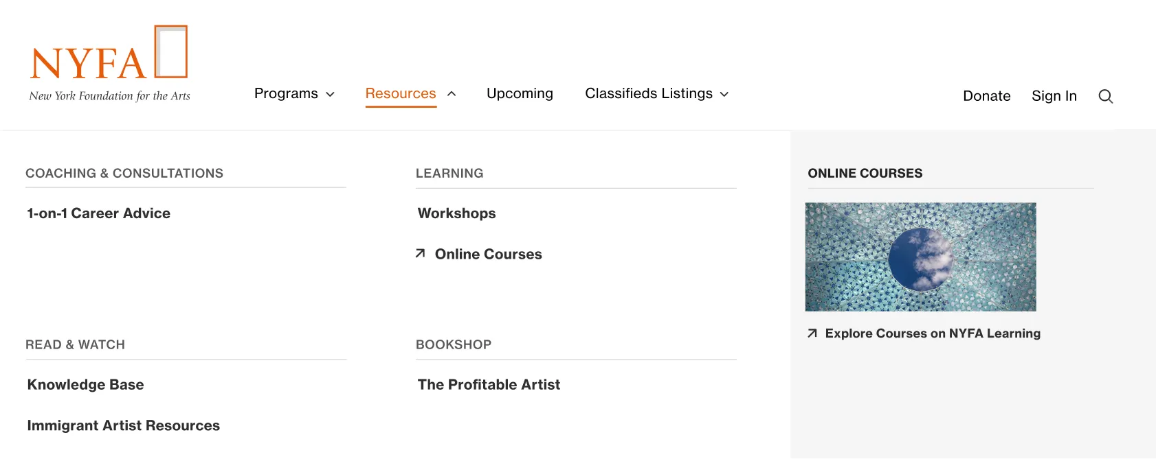
The navigation defined the high-level information architecture and was a major source of confusion, so I began there.
The confusion primarily came from an overwhelming number of options organized around internal structures and inconsistent interactive features, which led to many links being overlooked by users.
I created an initial redesign draft based on my observations and then ran combined card sorting and tree-testing sessions with 15 participants. The results from each card sorting round improved the design for the following round of tree testing.
The final design organizes the navigation based on what users found most intuitive. It also resolves the issue of donors mistakenly donating to the organization instead of specific projects.


Program Pages Redesign
One issue with program pages was that they were text-dense and mixed both marketing content and complex application instructions. Users often needed help when trying to apply for a program.
One bottleneck was confusing programs that required applications with those that did not.
I designed a layout for all application-based programs so they were easily distinguishable. This layout significantly reduced text and guided users' eyes to key sections.
It is consistent yet flexible enough to meet the diverse needs of over 20 programs, each with distinct elements.


- New side link section on the left to guide users to content at the bottom and to related links such as events to increase sign-ups.
- Rewritten UX copy that's much shorter and focuses on user benefits.
- New visual timeline to help users digest important dates.
- Use of accordions to collapse text to prevent long scrolls and to help users find relevant info quickly.
“When will I know the results?” is one of the most commonly asked questions.
Funds Portal Redesign
Users struggled to send payments and request deposits due to a confusing interface, unfamiliar terminology and complex process.
I designed a new dashboard where essential items and common tasks are immediately accessible upon login. For a more focused experience, I also removed unnecessary elements, consolidated the nav, and added interactive features to improve usability.
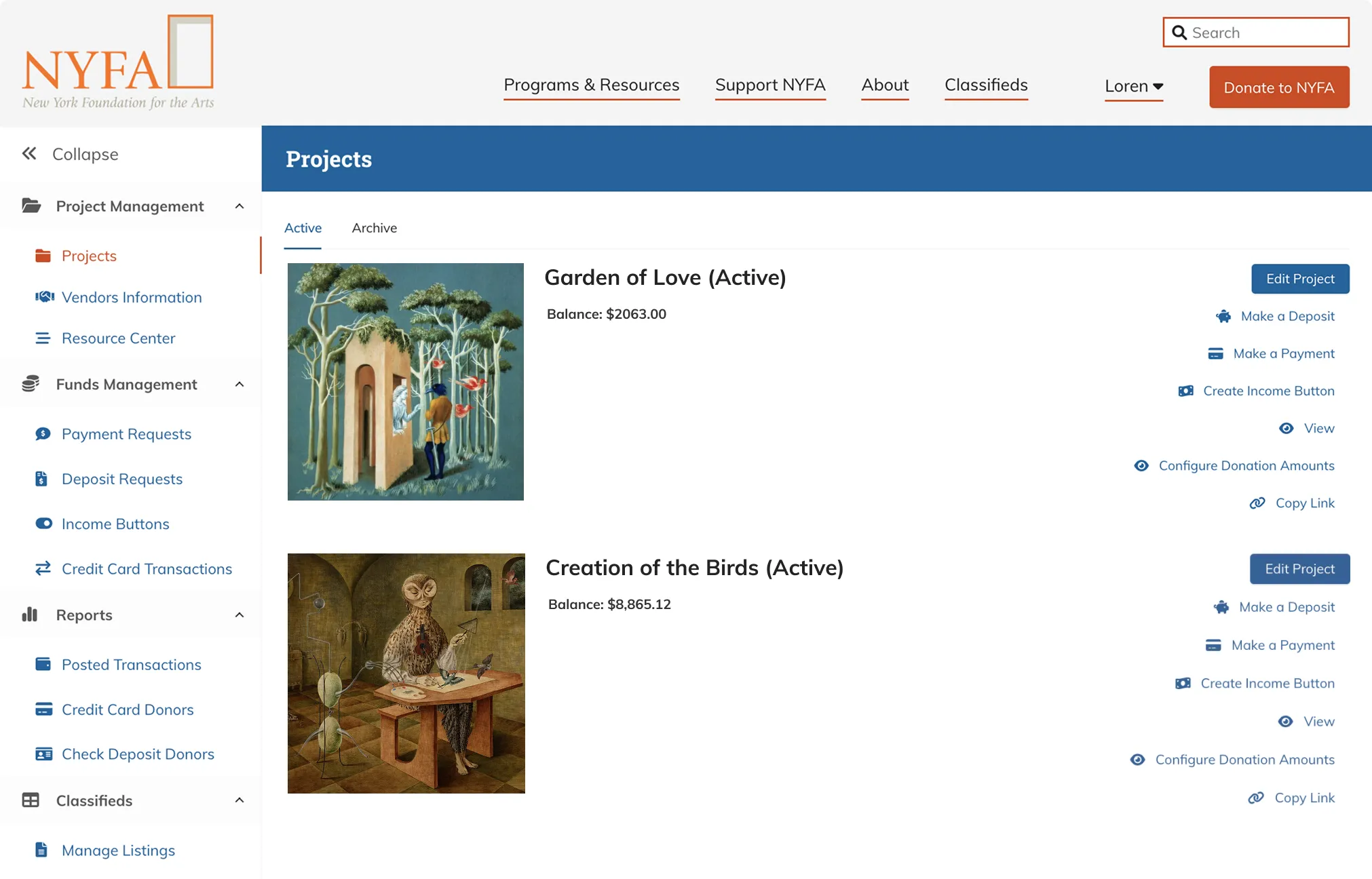

- New Quick Action menu upon login for easy access to most commonly performed tasks.
- An FAQs section placed above the fold to help navigate the platform.
Help Center Redesign
The Resource Center had long been overlooked, despite being the third option in the navigation. It has forms and how-to guides that were helpful for completing tasks within the app.
I redesigned the page and renamed it from "Resource Center" to "Help Center", based on my hypothesis that users struggling with a task would be more likely to seek help, rather than looking for resources.
Payment Flow Redesign
Most new users had trouble completing the steps to send payments. The how-to information shown here didn’t help.
My redesign strategically places guidance and resources exactly where users need them. I also matched form elements to each question type to make the form feel intuitive.


Reflections
There was a lot more to this project. I also designed a job board, listing portal, and sponsored project directory, to name a few.
New Design System
I built a new design system with components and patterns that made the current pages consistent while being flexible enough to support future product launches. For the visual direction, the goal was to stay close to the existing brand. I refreshed the look by introducing new typefaces, modern layouts, and increased color contrast for better accessibility.
Challenges & Learnings
This project felt like five different projects. NYFA's five departments are functionally distinct and have different user groups. Due to the time constraints, it was important for me to identify the priority. I also needed to be quick to adapt my research methods, design process, and how I worked with the engineers.
One thing I would have done differently is to spend a bit more time understanding the problems by sketching out initial ideas before diving into user research. It would have helped surfaced more targeted questions to ask.
“New York Foundation for the Arts is an arts service organization with many moving parts. I was impressed by how quickly and thoroughly Loren got up to speed on all of NYFA's offerings, and how she streamlined information into a more cohesive and professional looking site to meet both the needs and expectations of NYFA users. She was great to work with, well organized, and made every effort to be part of the NYFA team.”